Noise
GRAPHIC DESIGN
6 Hidden Meanings in Logo’s
Can you spot them?
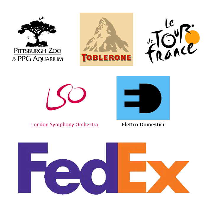
 I love these logo’s… not only are they beautifully created but they all contain hidden images that add to their effectiveness. Can you spot them all?
- The white space in this logo pops out a whole lot more than in some of the others so it shouldn’t be that hard to spot the monkey and lion staring each other down.
- An old favourite.. It seems that sweet makers have a knack for including hidden images in their logos. This one may be hard to spot at first but we’ll give you a hint: Toblerone was started in the city of Bern, Switzerland which is famously associated with bears. Now, look closely at Matterhorn Mountain and see what you find.
- There is a biker in there somewhere. Can you see him? He is literally on Tour. Notice how the “o”, “u”, and “R” all come together along with the yellow dot to form the image.
- At first glance it appears to be so simple but upon closer inspection you might notice some hidden imagery. Can you see the orchestra conductor?
- The Elettro Domestici, the Italian electric company, used an interesting mark designed by Gianni Bortolotti that has since become fairly well known in the design community. The Plug also created the hidden “E” to the left
- This is probably one of the most famous logos in this category. Just in case you’re somehow out of the loop, look between the “E” and the “x”. In the white space there is an arrow that subliminally represents speed and precision.


